Issue #35: My First Week with Apple Vision Pro
Howdy 👋🏾, my Apple Vision Pro arrived Monday, and for the last few days, I’ve done almost everything with these things on, and wow! If I had to sum up my experience, I would say Apple’s Vision Pro is truly magical and easily the best-mixed reality device I’ve ever used, but most folks should wait for version 2 or at least a few visionOS updates.
Fit and Feel
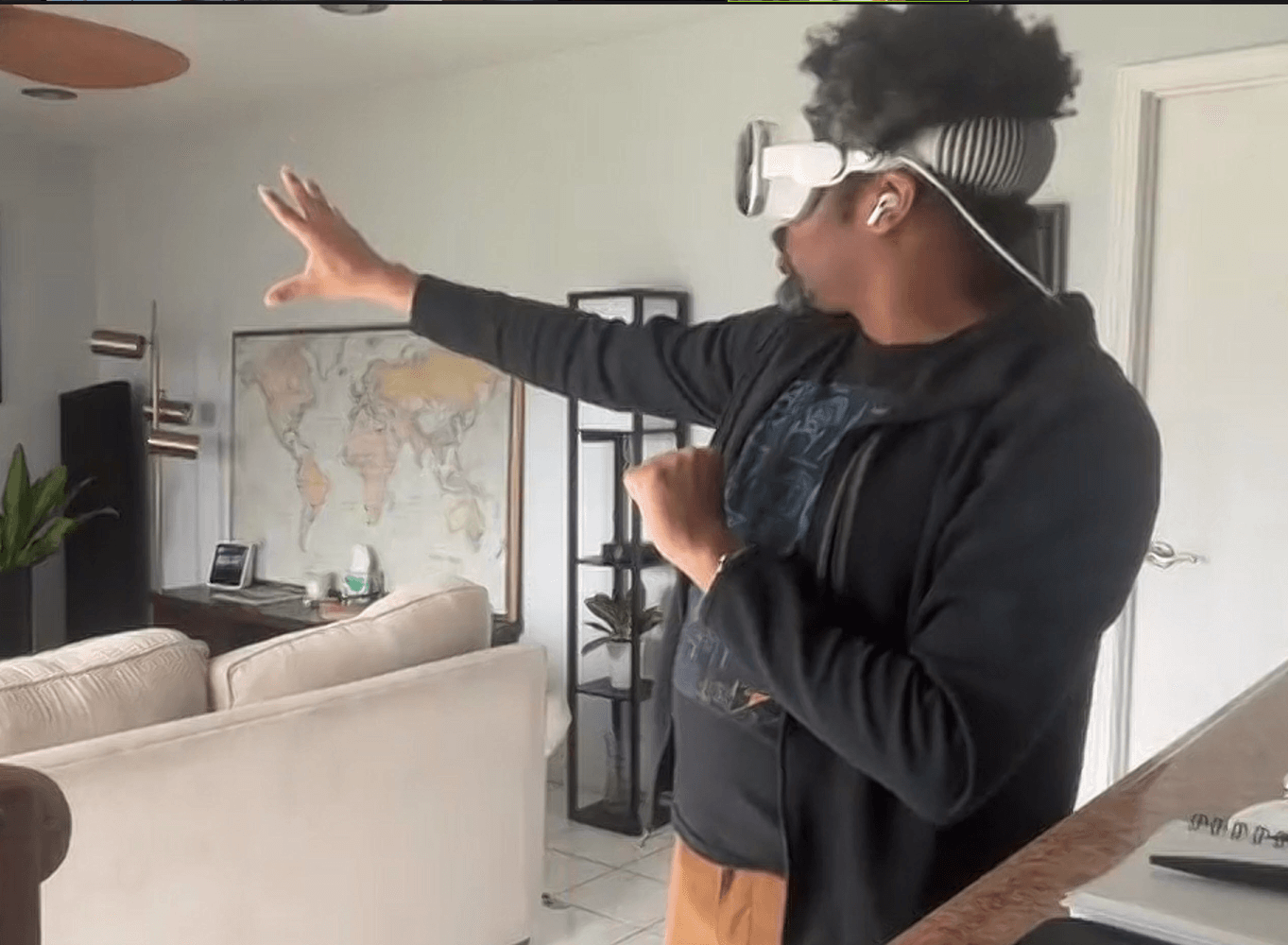
In prep for Apple Vision Pro, I spent several days wearing Meta Quest 2, which prepared me for the norm of wearing a device strapped to my head. However, the first thing you notice with Apple Vision Pro is that the device is heavy. Even with the heft, the compact construction makes it feel better than the large plastic casing of the Meta Quest 2. That said, the device suffers the same issues as all these headsets: you have to get used to the heavy weight on your face, straps help distribute the weight but run havoc on your hair, and over time, they grow more uncomfortable as an itch occurs or movement causes sweat or humidity to form.
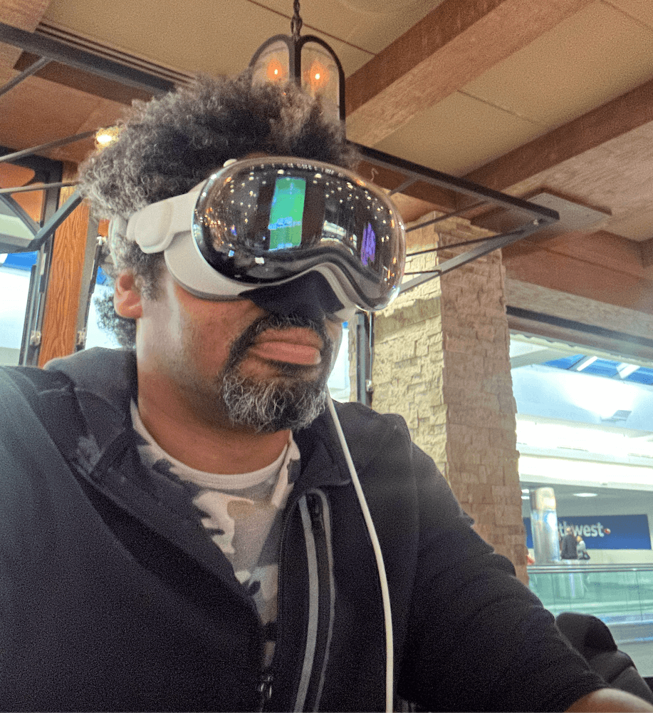
Apple Vision Pro arrived with two face guards, a Wide and a Wide+. I started with the Wide and struggled during the orientation stages to pass the eyesight test, so I switched to the larger Wide+ and the device worked with no issues. It fits comfortably, and you can adjust the strap by turning the dial on the side of the solo band for a tighter fit. I prefer to keep mine quite snug. Most of the weight pulls forward and sits above your cheek, but I had no issue using the device for hours at a time.
The display is both amazing yet lacking. It offers the best view of the outside world produced through a headset. Still, as many reviewers have mentioned, you’re quickly reminded that as stunning as these high-pixel displays are, our natural eyesight remains unmatched. After long uses, removing the glasses is a quick and stunning reminder of just how vibrant and bright the world actually looks. The cameras also struggle in low light – walking around the kitchen at night after turning off the lights looks pitch black in Apple Vision Pro.
Apple Vision Pro gives you a narrow field of view that I can best describe as viewing the world through goggles. The perspective is fairly limited and gives a sense of tunnel vision that reminds me of first-generation VR headsets. If I could make one change to the next Apple Vision Pro, I would start by enlarging the field of view from 110 degrees to meet what is possible with the Meta Quest series.
The power cable drove me crazy. I love the feel of the braided cable, but the texture allows it to get knotted up very easily and makes smoothing the coils much more difficult. This often shortened the cable length.
My last quibble is that drinking coffee or water can be tricky. I spilled water down my shirt on my first attempt at drinking from a wide-brim glass. The issue is that some cups are too wide and bump against the nose bridge depending on where the headset sits on my cheeks. It’s also hard to estimate whether a glass, cup, or bottle will fit under the headset, leading to some unexpected exploring.
Entertainment
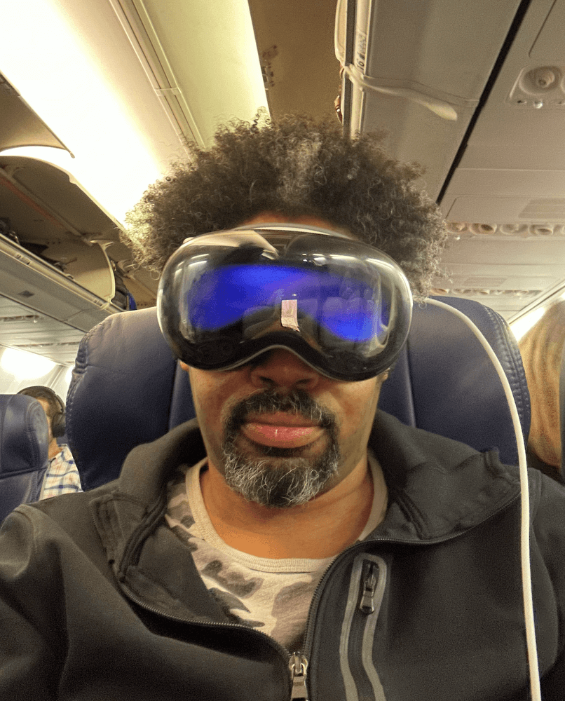
A few hours after unboxing, I headed to BWI airport for a flight. I had two goals: try out Apple Vision Pro in the busy terminal and recreate the Apple keynote experience of sitting back on a cramped flight and watching a movie in an immersive space.
I walked into Zona Cocina, a Mexican restaurant in Terminal B at BWI airport, and cozied up to the bar with my bags to order a drink while exploring Apple Vision Pro and surfing the web using the virtual keyboard. While reading the latest news, I grabbed my glass of wine and immediately sighed as I dribbled wine down my shirt, trying to get the aim right to sip from my glass. Annoying but not a deal breaker.
While perched on a bar stool, I plastered the walls with a web browser, news, and lyrics from a music player. I also watched video snippets on a giant floating screen – a wonderful experience allowing private surfing without feeling peered upon.
My phone buzzed, signaling it was almost time to board. I closed my tab at the restaurant and made my way to the gate, storing the headset in my bag until I could get settled in. Once seated in my aisle seat, I eagerly strapped it back on and enabled travel mode. This mode helps Apple Vision Pro compensate for the movement of planes, trains, and automobiles when anchoring objects.
After takeoff, I swirled the immersion dial, transporting myself to a starry Joshua Tree vista with a relaxing playlist through my AirPods Pro. Pausing the music at one point made me feel at peace, only hearing subtle nature sounds from the immersive environment; it was lovely. Once comfortable, I launched the 3D version of Marvel’s Ant-man Quantimanium on the Disney Plus App for my in-flight entertainment. With my seat back, I scaled up a massive display against the midnight view of Joshua Tree and escaped into the movie.
A few minutes in, I felt a poke and removed the headset to find a stewardess there. Between immersive video and noise cancellation, I must have missed her pass-through video appearance.
After landing and getting home, I explored Apple TV+ shows like Adventure, which reminded me of 4D venues like Las Vegas’s Sphere, allowing you to feel transported to a different world. Gorgeously real views high amongst the mountains in the first episode made my heart skip a beat. If someone pointed a fan at me at the right moment, it would have induced a fearful jump.
Apple’s immersive content feels more present than just 3D by breaking the frame. It’s incredible and could be very compelling on its own. I hope they keep expanding beyond documentaries into shows like For All Mankind or Foundation.
Work
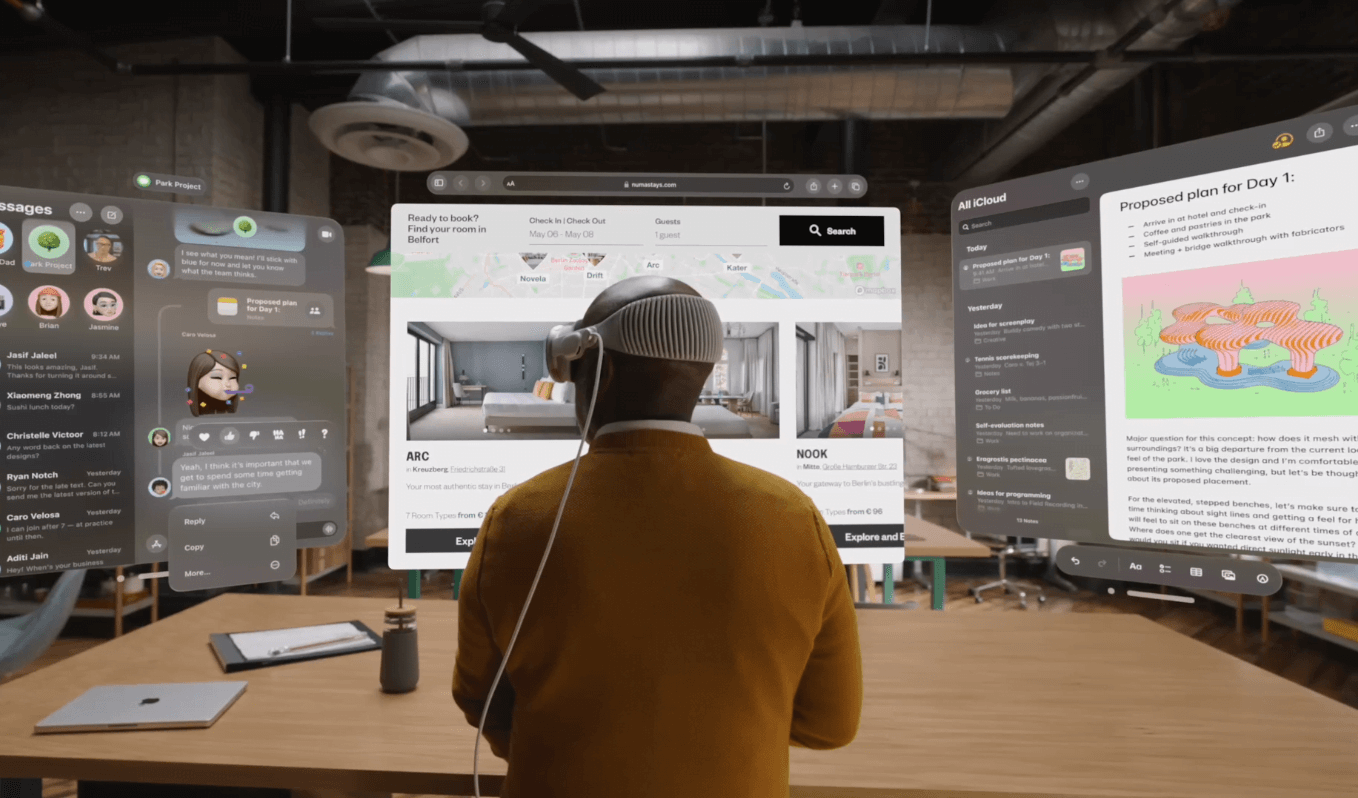
I can’t go back to only using a laptop after experiencing Apple Vision Pro. I set up my laptop in our den to display a massive floating screen in the attached kitchen – it was magnificent. I assumed limitations like the lack of multiple displays would make screen sharing underwhelming. Instead, I found that the giant screen combined with the App Store allowed me to position apps around me, creating a wraparound dashboard that felt like my own mission control.
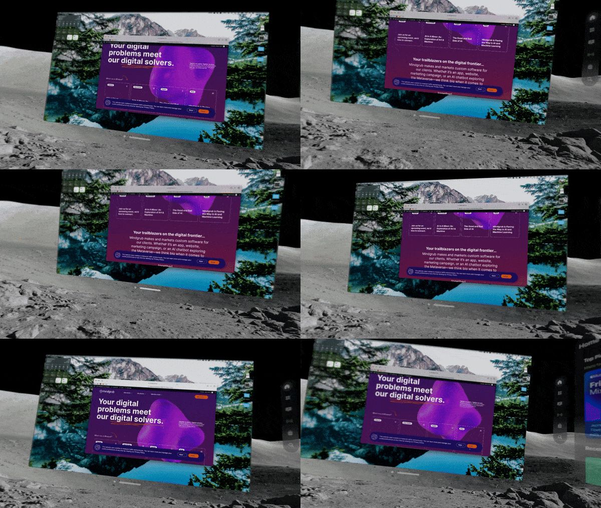
Everything needed is a glance or whirl away, firmly anchored wherever placed, even when leaving and returning to a room. Each virtual display stays precisely positioned and handles lighting beautifully, feeling intensely real.
Apple Vision Pro works superbly until limitations arise – a theme with this ambitious device. An example is continuity, something that Apple’s ecosystem has thrived on. With AirPods paired to my Vision Pro viewing my laptop screen, I still couldn’t route laptop audio to the headphones. Despite settings tweaks, public laptop speakers blared while hearing a video privately through AirPods. Similar Bluetooth confusion happened when toggling between keyboard and trackpad connections.
The iOS/iPadOS ecosystems nicely fill app gaps. I easily loaded frequently used apps like Slack that mostly work well, but apps with visually busy interfaces or clustered buttons became frustrating to use. Adding a Bluetooth trackpad readily solves this.
The biggest work annoyance is needing a laptop to run macOS apps natively, like Xcode. This feels like an invisible leash preventing specific tasks anywhere while the blank-screened laptop sits unusably nearby. Many iOS/iPadOS apps aren’t robust enough alternatives.
Personas
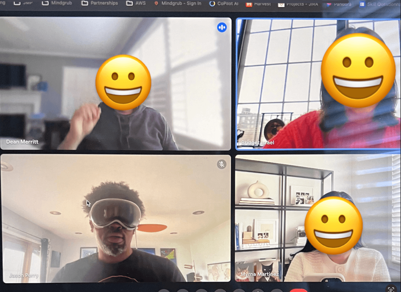
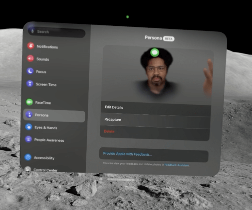
Personas are weird in an uncanny valley type of way. My first scan gave me a bit of an afro, and I struggled to capture all the details accurately. After upgrading to the latest visionOS beta, it did a better job grabbing typical traits. You can also accessorize your Persona with glasses or other items to better match real life.
Despite expectations, Personas turn out much better than imagined, and you get used to them on FaceTime calls. The facial motion and eye capture are incredibly lifelike – I can easily perceive subtle expressions. While not photo-real, they avoid the creepiness some may envision. After scanning multiple times and tweaking options, your digital double becomes a friendly face.
Software
Lots of these quirks are software issues that feel incomplete or not quite polished. The current version of visionOS could use a few new releases, and I can’t wait for version 2.0.
Continuity remains the biggest hiccup for a device dependent on Apple’s ecosystem. The spatial audio speakers are so good that sometimes you think headphones are playing, but conversations are blasting publicly. What’s most upsetting about this is, from what I can tell, you can’t do much to fix it; you’re stuck pairing and unpairing until it works, and any small thing can make it just stop working.
Eyesight control is great when working but horrible when inaccurate. I often incorrectly selected dialog options as my eyes drifted or the headset shifted. This struggled on complex, clustered interfaces like YouTube’s video player.
Eyesight is paired with touch actions that feel natural. Still, the language is not always intuitive and can leave you confused about what to do next. For me, this was whenever I found myself in a dialog I wanted to escape or cancel.
Some interface ideas missed the mark, like the Digital Crown controlling both the reality dial and volume. Quick audio tweaks or needing to mute after discovering a conversation or phone call was public required more than tapping or turning a dial.
The worst miss is the Control Center. It requires you to look up to activate it and normally hides always-present information, like the date and time. Control Center’s icons also have no labels, so you can’t easily tell what anything does on a device with the biggest canvas imaginable; whose idea was that?
But the worst is notifications, which might be the most annoying implementation imaginable. They float in front of you, blocking what you’re working on and sitting forever.
I love this device, but it feels a little early and not fully baked, just like some of the ideas the Apple Watch Series 0 shipped with. For that reason, I can’t say buy this product today, although I believe it marks the beginning of an incredible revolution. Guys and gals, version 2 or 3 of visionOS and the Vision Pro will undoubtedly make this a must-have product. Now, on to my thoughts on tech and things:
⚡️ Google rolled out a new and more powerful AI model named Gemini and is updating its branding to drop the names Bard and Duet. I haven’t had time to check out the new model, but The Verge has a write-up on the new release.
⚡️ The Whitehouse announced a new AI Safety Institute to establish AI testing standards, and over 200 companies have signed on to the consortium. The hope is that this new group defines standards to test AI and ensure it is safe for businesses and customers.
⚡️This will be the year AI gets deeply integrated into everything we do, and the rumor is that iOS 18 and WWDC could be a huge AI release with tons of new generative AI features. Will Apple go from not mentioning the word AI in any of its events to integrating 30+ acquisitions into its platforms?
I forgot to mention that I ordered prescription lenses for Apple Vision Pro. They haven’t arrived for some reason, so I slipped in some contacts for my tests. I’ve noticed some weird things that make me wonder how this impacts the retina tracking, so I’m looking forward to comparing how well the lenses work versus contacts. I’ll keep you posted and have more thoughts over the coming weeks.
-jason
p.s. While everyone worries about artificial intelligence and robots taking control, the real vector of attack might be an army of Internet connected toothbrushes forming a bot network and targeting popular websites and platforms. Ultimately, this turned out to be a false story, but it’s a reminder that anything connected to the Internet can be compromised. Keep safe, folks.
